SoundFi
2018
Personalized 360° audio for theatrical movies
Problem
The quality of the audio experience in movie theaters is lacking, both in quality of the experience and accessibility for those who want to listen in a different language.
ISBX, where I was the lead designer, was contracted to build an initial version of the app with which the client could pitch investors.
My Role
UX & wireframes
Art direction
Mobile UI design
My Role
UX & wireframes
Art direction
Mobile UI design
My Role
UX & wireframes
Art direction
Mobile UI design
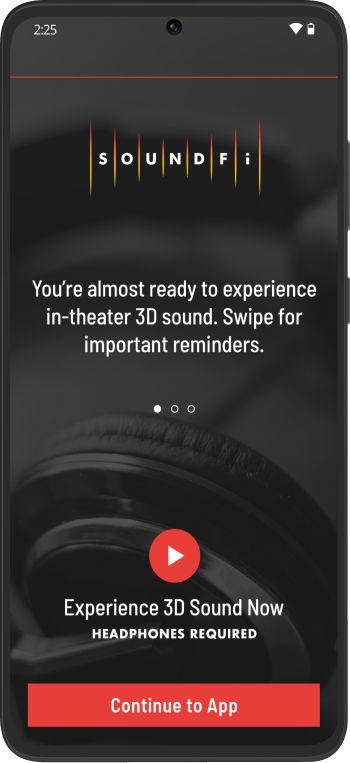
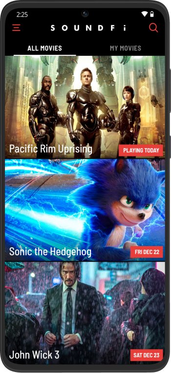
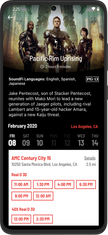
Requirements & User Stories
The initial feature set of the app was just enough to show off to investors and studio executives.
Requirements & User Stories
The initial feature set of the app was just enough to show off to investors and studio executives.
Requirements & User Stories
The initial feature set of the app was just enough to show off to investors and studio executives.
Create Account
Create Account
Create Account
Browse Movies
Browse Movies
Browse Movies
Checkout
Checkout
Checkout
Theater Pre-Check
Theater Pre-Check
Theater Pre-Check
Audio Playback
Audio Playback
Audio Playback
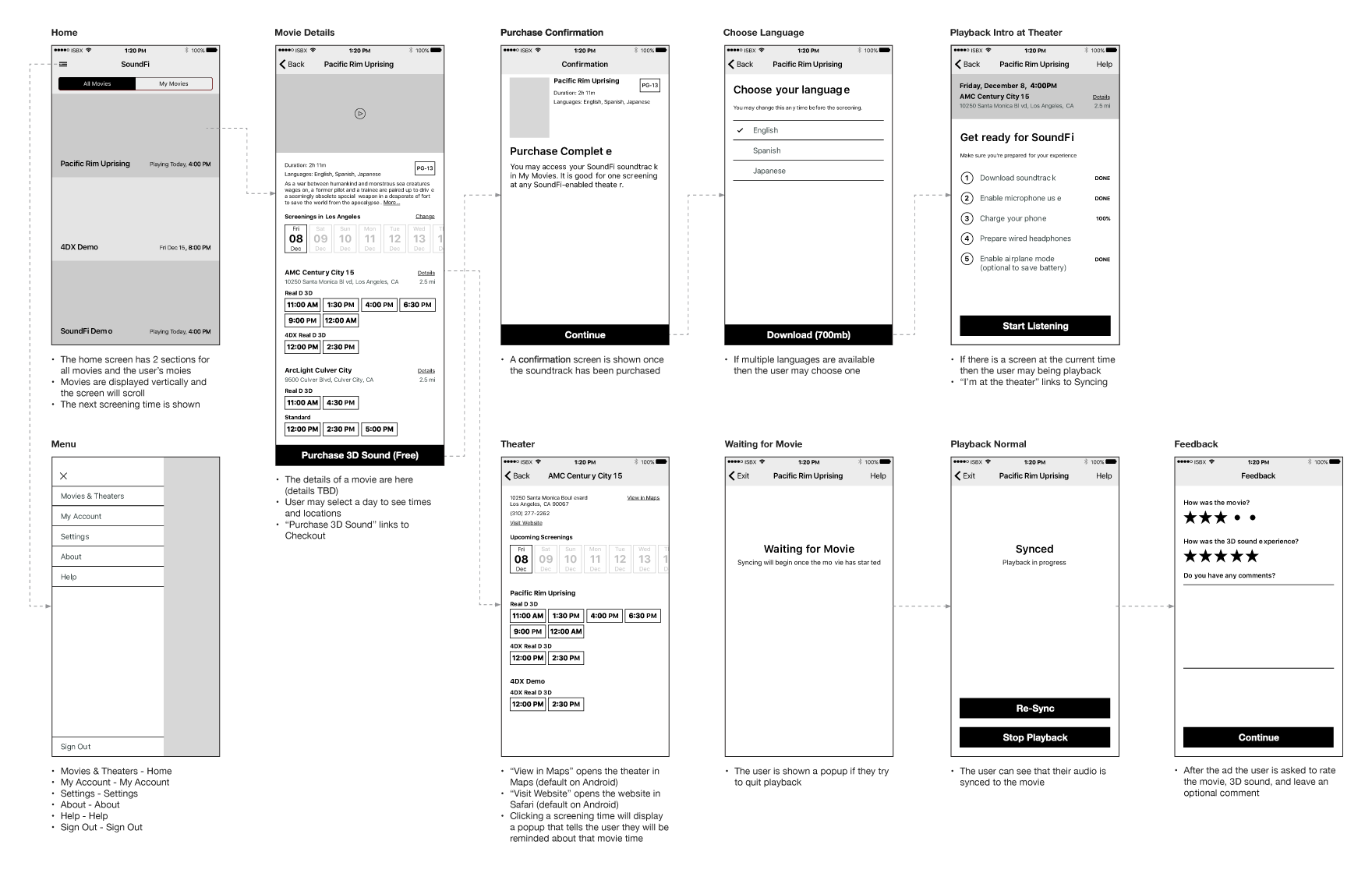
Wireframes
A complete set of wireframes was built to quickly map out the features and flows of the app. This helps save time with the client as they can focus on the functionality without being concerned about visuals.
User Testing Results
We ran many paid user studies to test the UX of the app. Although users weren’t actually paying for the movie soundtracks, they had to enter a promo code and doing this first was confusing for them. We moved this step to after the date & time selection so it made more sense.
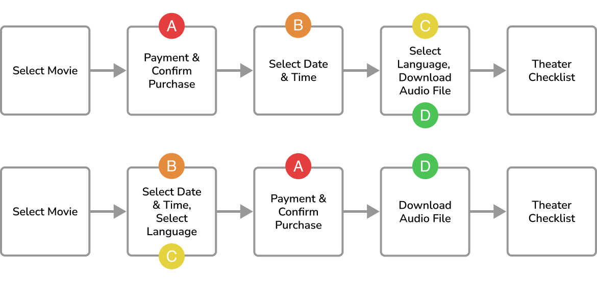
Design Evolution
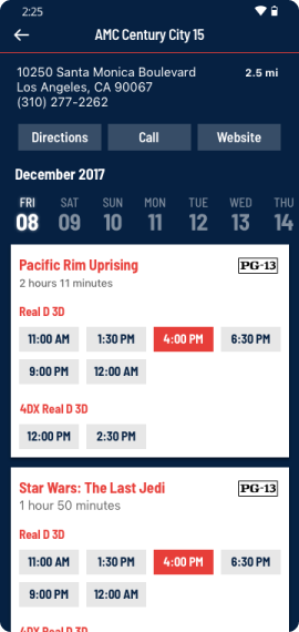
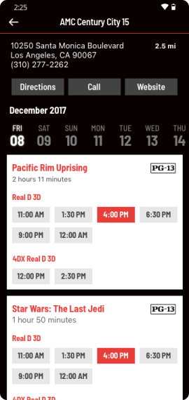
The design of the app changed through research and user testing. Colors were updated to better reflect the movie theater theme and button designs changed after users reported they didn't realize they were tappable.
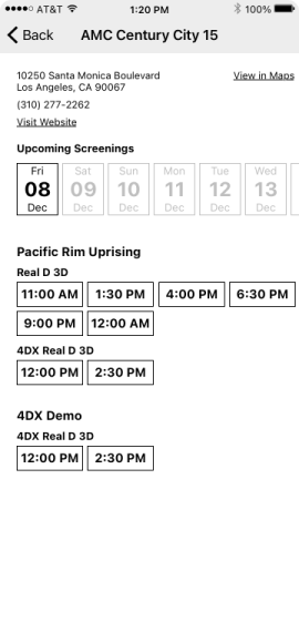
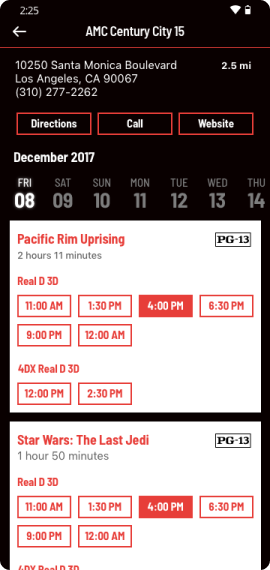
Initial wireframe
Color and typography added
Blue replaced with black for a movie theater feeling
Button design updated for better usability
Playback
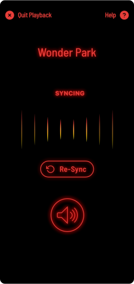
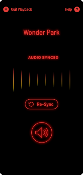
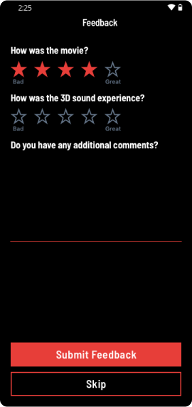
Prior to playback, we provide a checklist of items to users that must be complete. This ensures an optimal experience. Once in the theater the app listens for an inaudible cue that syncs the movie to their device’s audio. The in-theater screens were purposely designed with only black and red to minimize distracting light leak. We included a form that is displayed after a movie is complete through which we received valuable feedback about the app and the user’s experience.
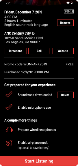
Theater checklist
Syncing in-progress
Audio synced
User feedback
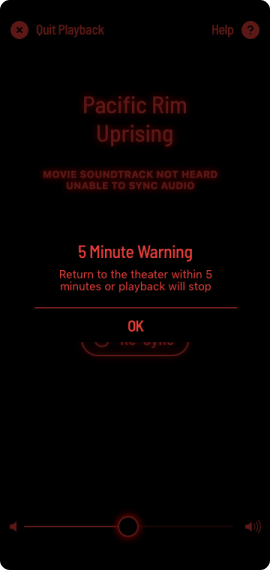
User Instruction & Guidance
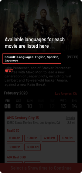
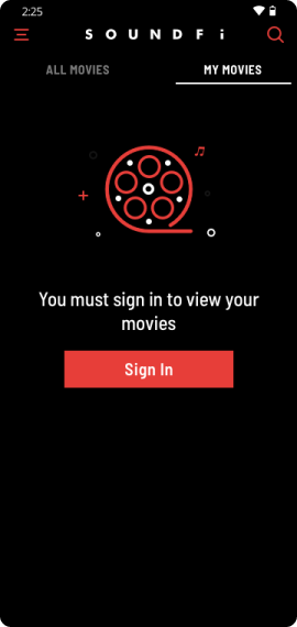
We wanted to make sure that users were comfortable with the app and included many instructional screens to guide them.
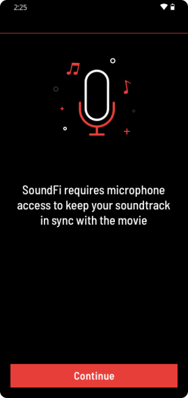
Permission priming
Language indicator
Empty state
Pop-up warning
Results
SoundFi launched to a limited test market and quickly expanded to multiple countries and many languages. It was designed and developed for both iOS and Android platforms, ensuring everyone could use it.
LANGUAGES
24
LANGUAGES
24
LANGUAGES
24
COUNTRIES
4
COUNTRIES
4
COUNTRIES
4
APP PLATFORMS
2
APP PLATFORMS
2
APP PLATFORMS
2
Copyright
© 2023 Michael Gladstone
Contact
info@michaelgladstone.com